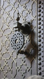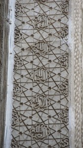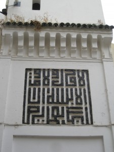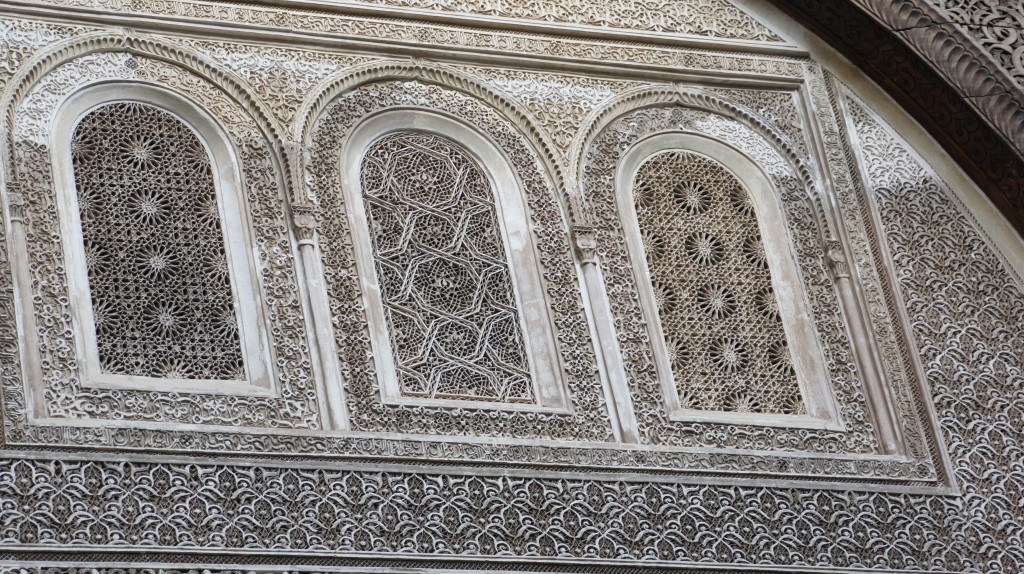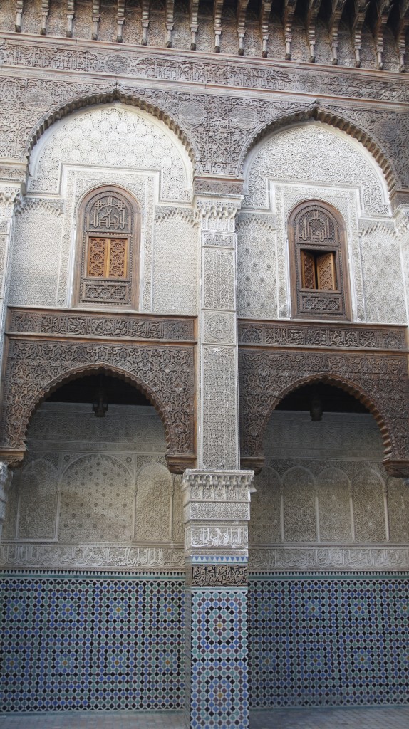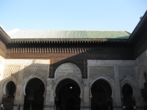
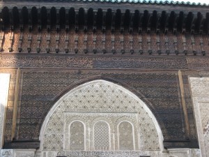
The problem with entering a space like the courtyard of the Bou Inania or Al-Attarine is that the design is overwhelming: it feels impossible to process all the wealth of visual detail and beauty. (Rather than focusing on a single place in this post, I’ll be using images from both medersas [Islamic schools] as I wrestle with the kinds and inter-relationships of Islamic patterns.)
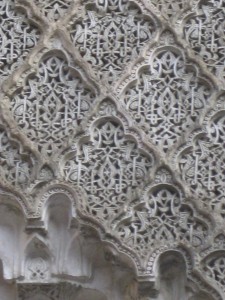
Perhaps if one were a student here, living and studying and praying in this space every day, the pattern would work on you at a subliminal level—or perhaps each day you might pick out a different element, a different image or detail, as a kind of meditative practice, focusing your mind.
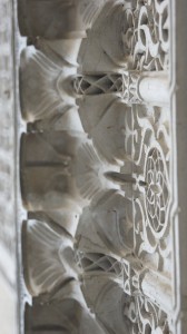
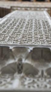
But for those of us merely passing through, how can we receive the gift of this place more deeply than a superficial, dizzying glance?
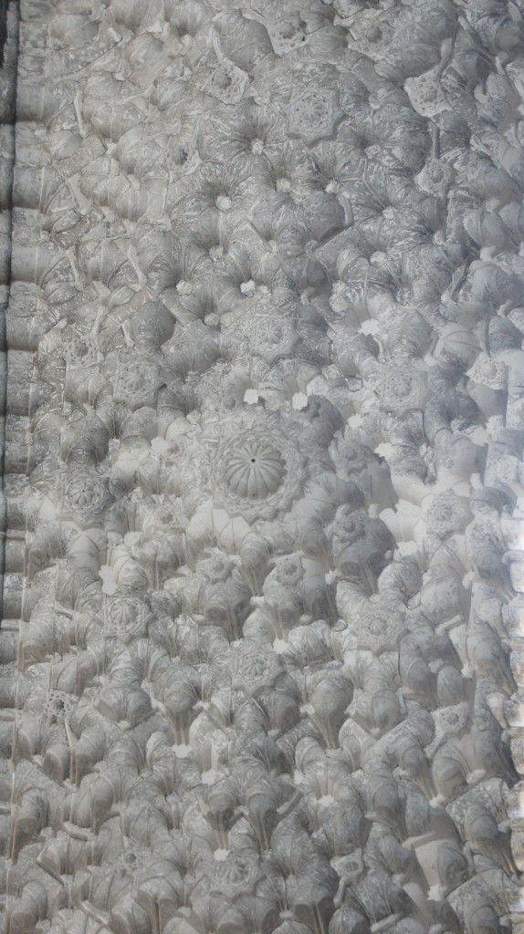
Does analysis help? Isolating specific elements to try to understand their meaning, before reconsidering them in context?
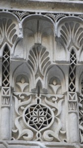
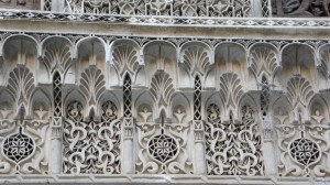
Maybe if you’re Adam or Richard, it helps significantly. But even for me, slowing the eye, forcing it to rest and register, is a useful exercise.
How do we learn to look in this kind of a space? Let’s start with the architectural layering:
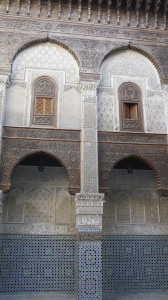
geometric patterns on the floor
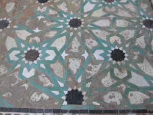
speaking to the zellij on the lowest level of the walls,
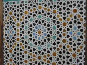
with calligraphy at eye level,
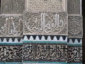
then biomorphic plaster carving
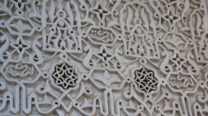
leading up to intricately carved cedar wood,
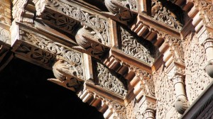
which leads the eye still higher, to the heavens. The cedar may be the only original component here: the plaster has certainly been renewed, and some of the zellij shows its age.
According to Daud Sutton, “The visual structure of Islamic design has two key aspects: calligraphy using Arabic script—one of the world’s great scribal traditions—and abstract ornamentation using a varied but remarkably integrated visual language.” (Islamic design: a genius for geometry, 2007, 1)
Calligraphy
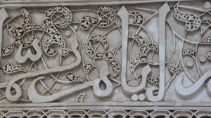
Calligraphy tends to be placed at eye level or slightly above—never below the head—and it turns the oral tradition of the Qu’ran (which, as you may know, is the recitation of the visions granted to Mohammed, and only belatedly a written text) into luxuriant visual beauty. For anyone struggling to read Arabic script, the beauty quickly overwhelms the meaning, but for students writing and memorizing different verses of the Qu’ran on a daily basis, the beauty presumably extends the meaning of the verse.
Geometry and biomorphic design
The ornamentation surrounding this calligraphy “revolves around two poles: geometric pattern, the harmonic and symmetrical subdivision of the plane giving rise to intricately interwoven designs that speak of infinity and the omnipresent center; and idealized plant form or arabesque, spiraling tendrils, leaves, buds and flowers embodying organic life and rhythm” (Sutton, 1). Infinity and the omnipresent center: Allah is the center of all things, of the infinitely varied development of the universe. For Keith Critchlow, geometry “reflects the facets of a jewel, the purity of the snowflake and the frozen flowers of radial symmetry” while biomorphic design registers “the glistening flank of a perspiring horse, the silent motion of a fish winding its way through the water, the unfolding and unfurling of the leaves of the vine and rose.” (Islamic Patterns: An Analytical and Cosmological Approach, 1976, 8) All three aspects of Islamic pattern inter-relate: biomorphic pattern relies on geometrical relationships for its tessellation and expansion;
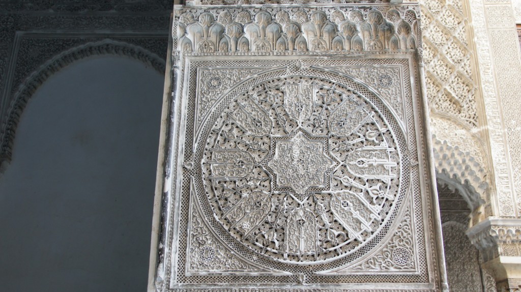
and different modes of Islamic calligraphy may lean toward biomorphic flowing lines on the one hand
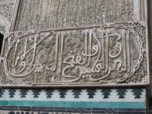
or more fixed geometric shapes on the other.
Biomorphic design
Adam stresses the logic inherent in the biomorphic elements of Islamic design: spirals are curves that look back to their points of origin. Biomorphic designs flow out, then back, bowing in humility to the creator. Balance is central to biomorphic design: nothing should stand out. All is humility and peace.
And well-nigh impossible beauty:
